Cell type markers pie plot
This visualization function can be launched from class DigitalCellSorter at the stage of pre- and post-processing.
From submodule VisualizationFunctions:
-
class
VisualizationFunctions(dataName='dataName', saveDir='', matplotlibMode='Agg', safePlotting=True, verbose=1)[source] Class of visualization functions for DigitalCellSorter
-
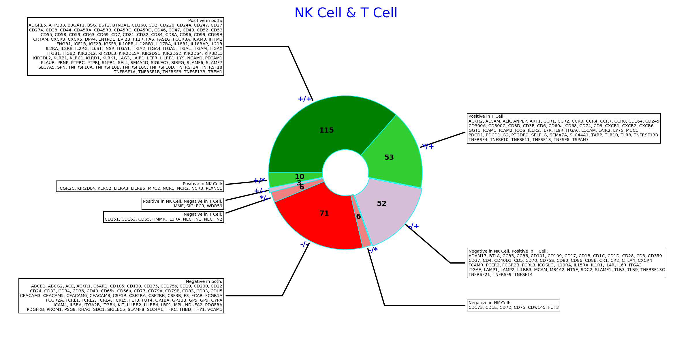
makeCellMarkersPiePlot(*args, **kwargs)[source]¶ Make summary of markers comparison between two cell types.
- Parameters:
- type1: str
Name of the first cell type to compare
- type2: str
Name of the second cell type to compare
- df_marker_cell_type: pandas.DataFrame or str, Default ‘all’
Celltypes/Markers matrix. If ‘expressed’, then only expressed markers will be used. If ‘all’ then all markers of the input marker list will be used. If an instance of a pandas.DataFrame is passed, then its all markers will be used.
- nameToAppend: str, Default None
String to append to the figure file name.
- listUnexpressedMarkers: boolean, Default True
List (highlight) markers that are not expressed. This option is ignored unless df_marker_cell_type==’all’
- orthogonalSectorsShift: float, Default 0.1
Sectors marked as ‘+/-’ and ‘-/+’ are shifted off-center. Set this parameter to zero to have round continuous pie chart.
- rotationAngle: int or float, Default 0
Angle in degrees that will rotate the whole pie chart counterclockwise.
- dpi: int, Default 600
Resolution of the figure image
- extension: str, Default ‘png’
Format of the figure file
- Returns:
Marker lists split into categories.
- Usage:
DCS = DigitalCellSorter.DigitalCellSorter()
DCS.makeCellMarkersPiePlot(‘T cells’, ‘B cells’)
-
Example output: